


In our conversation with Donyea Tollie about a bathroom project featured in Cambria Style magazine, she discusses using statement wall coverings, why Cambria is her go-to for surfaces and countertops, and how she creates storage without sacrificing style.
What were the goals you discussed with your client in the course of planning this bathroom?
This particular bathroom was a part of a full design build for the actual home, so this was just a small project within a big project. The two daughters actually contacted me, and their brief was basically to create a modern colonial home for their mom and dad, who are getting ready to retire. So I technically had four clients. What the homeowner said to me [about the powder room] was, “I want to have a place where I can get lost.” She wanted to go in there and not have to ever feel like she has to be in a hurry to get out.
May we all find such an escape. Are there any particular design gestures at work in the space to which you’d like to draw our attention?
The wallpaper and the millwork. I feel like when we changed the room architecturally—when we put wainscoting in—brought the whole design together. And we chose the paint out of the wallpaper to enhance that wainscoting, so it all looks color drenched.
Close-Up on Cambria
What general impressions of Cambria led you to use it in this space?
I love Cambria. It’s actually my go-to product for surfaces and countertops. I first got introduced to it when I started working as a kitchen and bath designer for Lowe’s. So when it first came out, they were like, “Hey, we have this quartz countertop that looks like granite.” I was like, “Perfect!” So I went and visited a showroom, and they took me on a tour, and I fell in love: just so many different colors and variations. But the reason why I use Cambria is because you get the granite feel with the grain and the veining, without actually having to give up the durability that Cambria provides. And then they have an awesome warranty on top of everything else. So that’s why I will always choose Cambria.
What about the color and movement of Cambria Clovelly made it the right choice for this space?
I love the color variation. Really, what brought it home for me were the little touches of amber dots that go against the really dark veining. And then the fact that it’s on top of this really neutral background—it’s just so stunning. Also, since I had this brass hammered sink in there, it was going to be the perfect backdrop for that.
Finding Form and Function
How do you make sure a room like this offers functions like storage without dampening what you’re doing in terms of design?
It’s a hard balance, because, of course, we have to always go by the budget. This was a matter of remove-and-replace in this situation, but the biggest thing that I wanted to do was give them more storage because they had a small vanity in there, and then they had all this clutter on either side of it. So I really wanted to take up the full space on that wall. Then since we had that wainscoting that we did, I did not want to just put a regular little toilet paper holder in there so we used a stand. Really, what I like to do in a smaller space, as far as tricks, if I had an endless budget—I would try not to take up so much of the foot space. I would incorporate a lot of floating elements: a floating toilet, a floating vanity. I always like to integrate storage—if there’s a way to have niches in the wall or even a mirror having a nice medicine cabinet you can hide behind.
Are there any other impactful details you want to call our attention to—perhaps something that might not show up in a photograph?
That wallpaper is metallic. Look at the palm leaves. It doesn’t really come across in the photos, but when you’re in the room, it’s iridescent. So something that you might not get in a photo is how we paid attention to the layering of the lighting—the sconces on either side of the mirror have these leaves, so they cast this beautiful shadow. We have one giant chandelier in the ceiling, plus the two sconces, and that’s all we really needed in this space.
Opposites Attract
Having discussed some of the star players in the design, I was interested in how you combine all these elements without it becoming too much?
There are definitely some tricks to that. I really do feel like, for one, that color drenching is a huge way to do that. To me, it really makes the room feel much bigger and taller. Speaking of taller, something that we did was instead of just a regular square mirror in here, we did a really decorative mirror, but we multiplied it by three, and I layered them on top of each other.
I didn’t realize—it’s a great piece.
I always love the juxtaposition between rough and soft, or something very polished versus something very matte. So we really got that through the Cambria countertop, I always do a matte finish and against the hardware that we used—which is polished—they are just so stunning together. I also feel like you should do a good mix of high and low; so we definitely splurged on the wallpaper and also on the architectural details in there. But I also was very cost-savvy about the vanity that we chose, knowing that I was going to put a very nice countertop on top of that. The way we saved was that the hardware was included with the vanity, and it had this really cool gold etching around the doors, so it already came with a lot of flair.
Your Space Can Take Care of You
How did the homeowners react as the finished project came together?
I remember getting a text from the homeowner, and she was like, “Donyea—that wallpaper: Oh my God!” She was like, “I did not know it was going to turn out like that. It is beyond what I even imagined!” Because you show them a little sample, but when they actually see it on the wall—my goodness.
What else should people know about you as they experience your work?
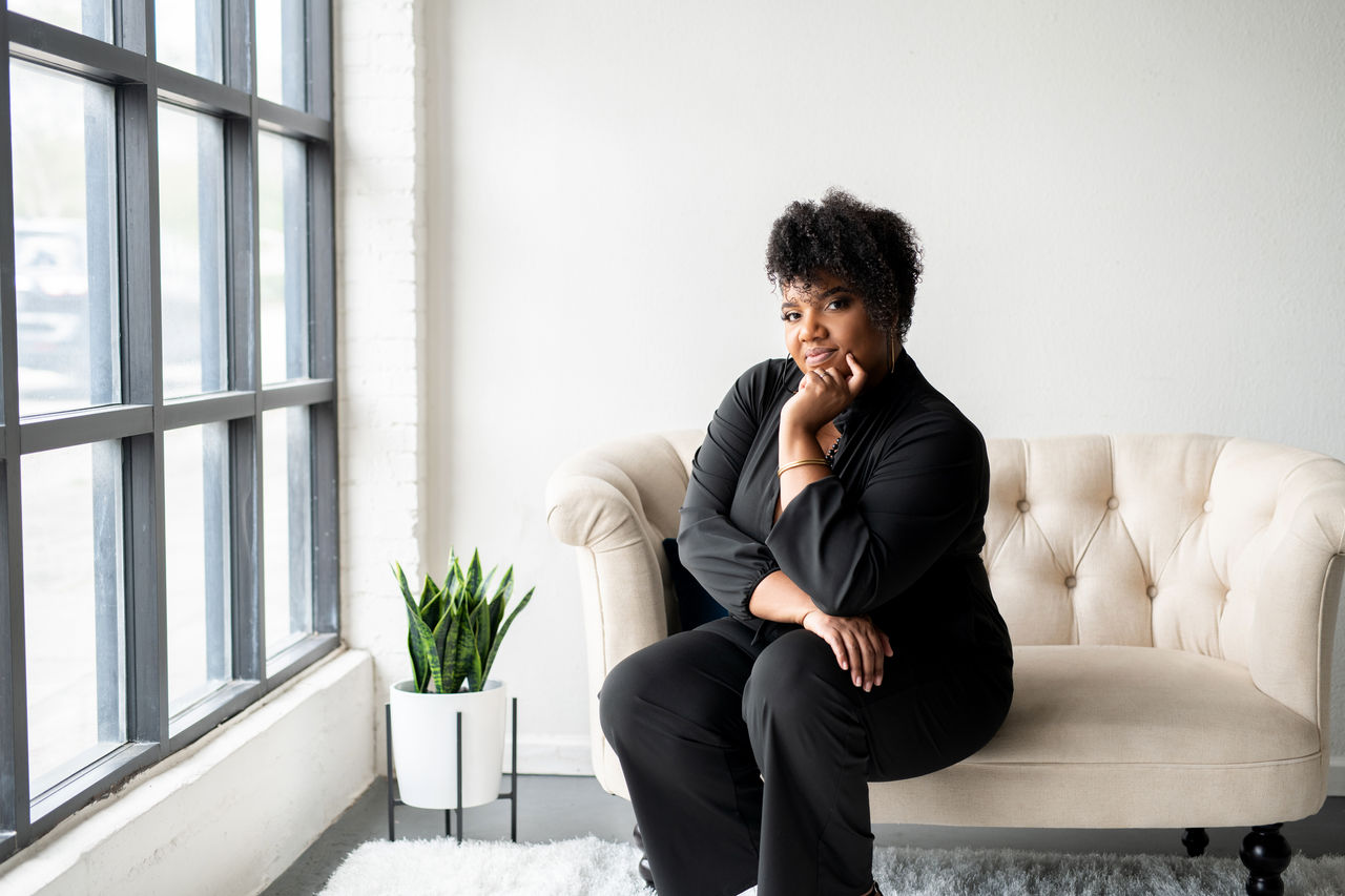
So, Rejuvenation Home Studio—we’re definitely focused on interior design being self-care. Our motto is: Take care of your space, so that your space can take care of you. Every single item that is curated in that space is thoughtful, intentional, and it goes through a process. It’s not like I just say, “Oh, this is pretty. Let’s do this.” It starts with a design board, concept words. It starts with questionnaires that we have to consider from the homeowners, approvals that have to come together. I want everybody to know we definitely focus our process on color, culture, and character. So, as long as it hits those spots at the end of it, the homeowner will feel like this space is personalized just for them, like we downloaded everything that they are within themselves and put it into this design.
Discover More
Get our beautifully curated collection of lifestyle stories, interior design trends, and expert advice sent straight to your home and email inbox with a complimentary subscription to Cambria Style magazine.
Ready to explore Cambria quartz designs in person? Contact a Cambria consultant or use our retail locator to find a professional in your area for project support and planning, material selection, or visualizing what’s possible.
Explore the #MyCambria Gallery to see how others transformed their spaces and follow us on social media.


